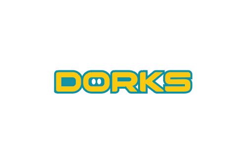
Dorks Logo
Dorks is a candy company that I did a brand design for including mockups and collateral. Their mission was to aim for a healthy alternative to conventional snack confections. The target audience they aimed for was health conscious parents buying food for kids. The yellow is supposed to represent the optimism the brand the holds. It is eye catcher for parents and attention grabbing for kids. The cyan is a nice contrast to the yellow which helps it stand out while also giving it this playful feeling to help gravitate kids towards the product. The style is very bold and confident which also helps it appeal towards children while also being on par with the brand.
